


Today we bring you a guest post by Joshua Ruiter. Joshua is a visiting assistant professor of mathematics at Batten University, where he uses standards-based grading in Calculus 1 and Introduction to Proofs. He completed his Ph.D. in mathematics at Michigan State University. Joshua lives in Norfolk with his wife where they enjoy going to the beach and playing cooperative board games like Spirit Island.
I was first drawn to alternative grading by the dream of properly aligning incentives. I would set up my course so that grade motivation and learning motivation aligned, and frustration would melt away. It’s never that easy of course, as I quickly ran into communication obstacles. Incentives can’t incentivize if they aren’t understood, and I wasn’t effectively explaining a new and unfamiliar system of pass/fail assessments and re-attempts without penalty in a way students could understand.
My biggest leap forward in onboarding students was developing a communication tool I call a grading heatmap. Along the way, I noticed benefits for course design. After some context on my own journey into alternative grading, I’ll talk about what a grading heatmap is, how it helps communicate with students, and finally its benefits as a conceptual tool for course design.
My journey into alternative grading
I teach at Batten (formerly Virginia Wesleyan) University in Virginia Beach, VA, a school with about 1500 on-campus students, many of whom are first-generation college students. I use alternative grading in early and intermediate math courses like Calculus 1 and Introduction to Proofs, with class sizes in the 10-25 range. I use a version of standards-based grading in which:
Final grades are determined by two factors: complete units (assessed through quizzes and exams), and complete homework assignments.
All grade thresholds have a minimum requirement in both categories, e.g. an A grade requires 11/12 complete units and 27/36 complete assignments.
Requirements for homework are intended to be high enough that investing time is important to students early on, but completing the last few homework assignments has low (or no) grade impact.
I use “unit”, “skill”, “learning target”, and “mastery” interchangeably, though I’ve moved towards “unit” because it feels right for one week’s worth of class content. Students complete a unit by passing two assessments related to that unit. At a baseline, they take three assessments per unit, with optional extras in the form of office hour oral assessments. My goal for the thresholds is that units are the limiting factor for most students. The point of item (3) is that in the final weeks of the semester, I want students who are concerned about their grade to focus on which remaining units they can complete through quizzes or the final exam, not what assignments they can rush through. At the same time, I want them to know that putting in time outside the classroom (by completing homework) is necessary to pass.
I’ve adjusted grade thresholds through iteration, but the biggest struggles and the biggest gains have been in communication. For the majority of students who haven’t experienced anything similar before, the necessary first step is for them to comprehend the intended incentives. Before talking about how heatmaps bridge this gap, I want to give context for how I used to communicate the grading scale. I would put all grade thresholds into a table like the one below, and say, “To earn a grade on the left, you must meet the requirements in both columns.” This was just what I had seen in example syllabi using standards-based grading.
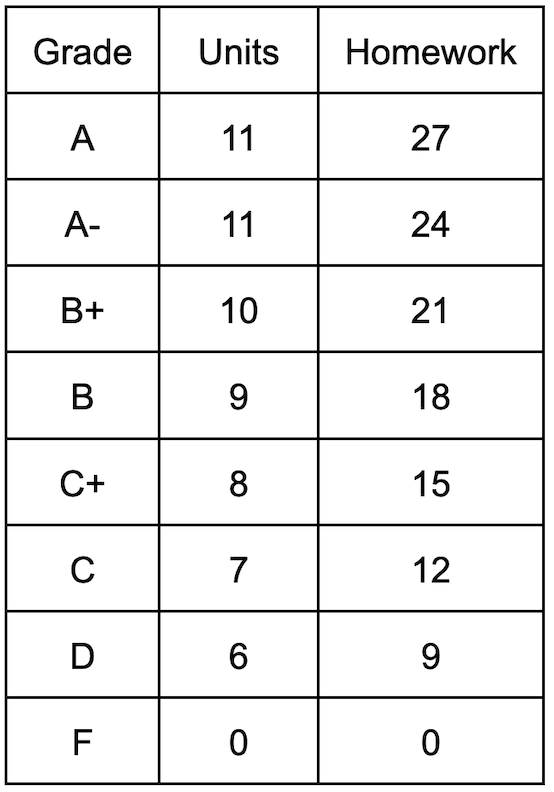
For example, a student with 10 complete units and 25 complete assignments receives a B+.
To my dismay, multiple students severely misinterpreted this table. Based on past experience, they steadfastly believed that some kind of averaging must be taking place. Students with 30 homework assignments and 4 completed units expected to pass, despite what I thought was clear and concise communication that anything less than 6 mastered skills would be a failing grade. After this disaster, I resolved to improve at communicating the grading scale, so I played around and came upon an alternative way of presenting the same information in a colorful chart I now call a grading heatmap.
What is a grading heatmap?
A grading heatmap is a 2-dimensional color-scale visualization of a rule for assigning final grades based on two input factors. In the grading heatmaps I use, the input factors are “units completed” and “homework completed.” The grading heatmap below contains precisely the same information as the table above. Our example student with 10 units and 25 assignments lands in the circled B+ cell.
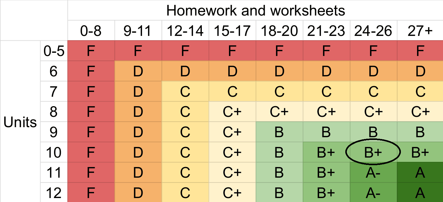
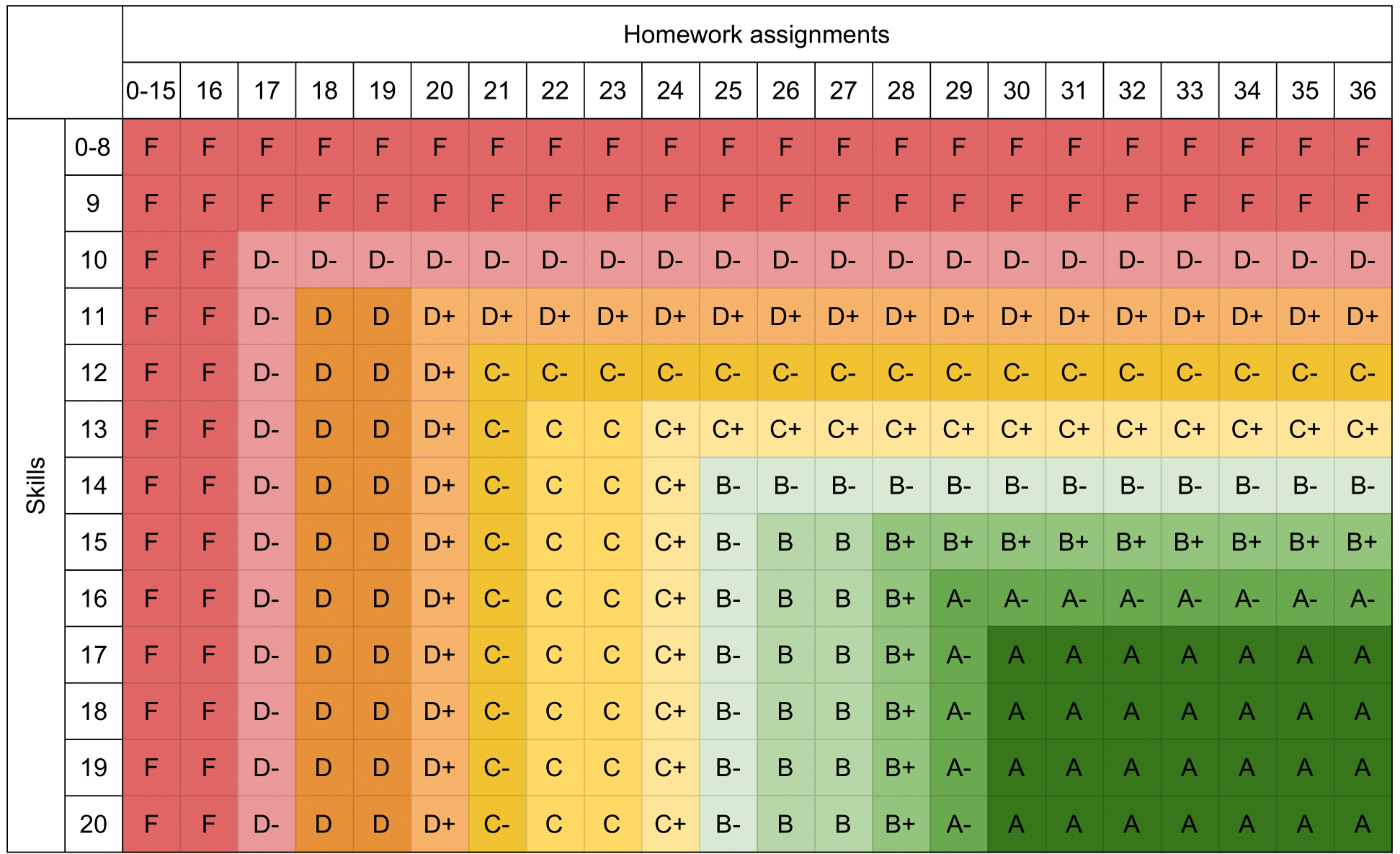
Producing these takes only basic spreadsheet tools (I use Google sheets). Below is an older example of a grading heatmap from Fall 2025. Contrasting it with the heatmap above, you can see how I’ve shifted over time to fewer units (from 20 down to 12) and added buckets in the homework category.
Why use a grading heatmap? I propose three primary benefits:
Students can easily determine their current grade using row/column lookup.
Heatmaps help students see how their grade could change, empowering them to focus on what matters.
In course design, working with a grading heatmap allows instructors to control the rate of change of grades with respect to different kinds of student work at different stages of the course.
Grading heatmaps as a tool for communicating with students
At its core, a grading heatmap allows fast lookup of a final grade knowing just two numbers, and importantly the lookup process is less susceptible to user error or user misunderstanding than a text table. But more than this, it also communicates information about the “progress gradient” at every point. Concretely, it answers every question of the form “If I have completed X units and Y assignments, which category should I focus on?” The answer is right there in the cells below and to the right of a student’s current standing.
For example, in the heatmap below, a student with 7/12 complete units and 20/36 completed assignments currently sits at a C grade, and improving their grade is only possible by moving in the vertical direction, by demonstrating unit mastery on quizzes. If they complete two more units, they’ll reach a B, at which point completing additional homework will be an avenue to a B+.
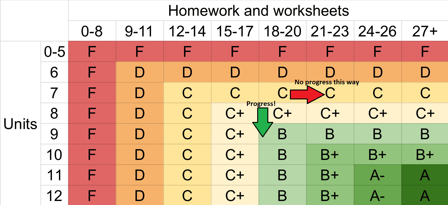
In helping students to visualize the progress made by their previous marks, the grading heatmap contributes to one of the four pillars of alternative grading: marks indicate progress. The heatmap shows not only current standing, but provides a map forward.
Grading heatmaps as a conceptual tool for course design
Finally, I want to share another benefit of heatmaps, namely as a conceptual tool for course design. While my teacher-to-student communication has improved, using grading heatmaps as a course design tool has been even more impactful for my growth in using alternative grading. They have empowered me to make concrete decisions about tradeoffs between different grading scales, and craft incentives for student behavior in a direct way.
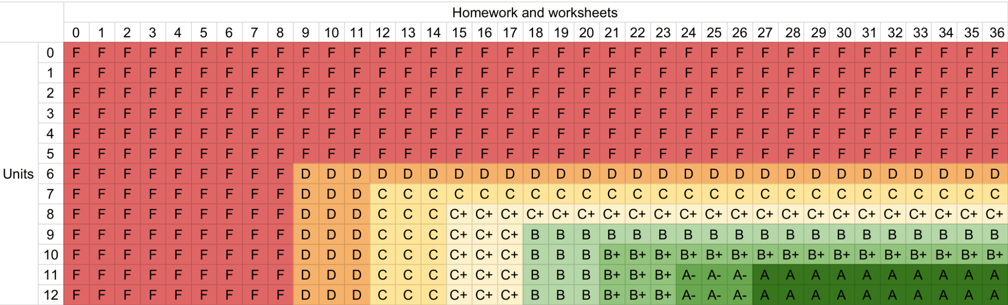
To illustrate the utility of grading heatmaps as a comparative tool, I’ll convert a traditional weighted average scale into a heatmap to compare with a standards-based grading heatmap above. To start, here is the same Fall 2026 alternative grading heatmap from earlier, in an expanded form.
For comparison, consider a grading scale where grades are determined by a weighted average of two categories (“units” and “homework”), then the percentage is converted to a letter grade in cutoffs: 94% for an A, 90% for an A- etc. down to 60% for a D-. For ease of comparison, the categories will be discrete and out of 12 and 36 respectively. Below is a table of percentages with even weighting between the two categories. As seen in the top right and bottom left corners, fully completing either category gets to 50%.
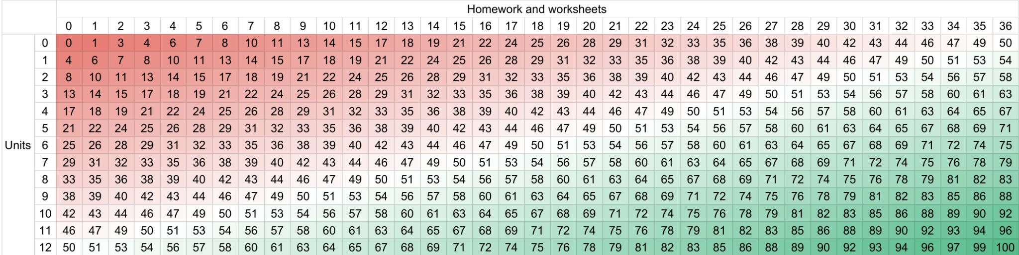
The color gradient is smooth because at any point in this table, improving in either category slightly increases the final percentage. This smoothness obscures the truth that grades are computed in discrete cutoffs, so we apply the letter grade cutoffs and get the table below.
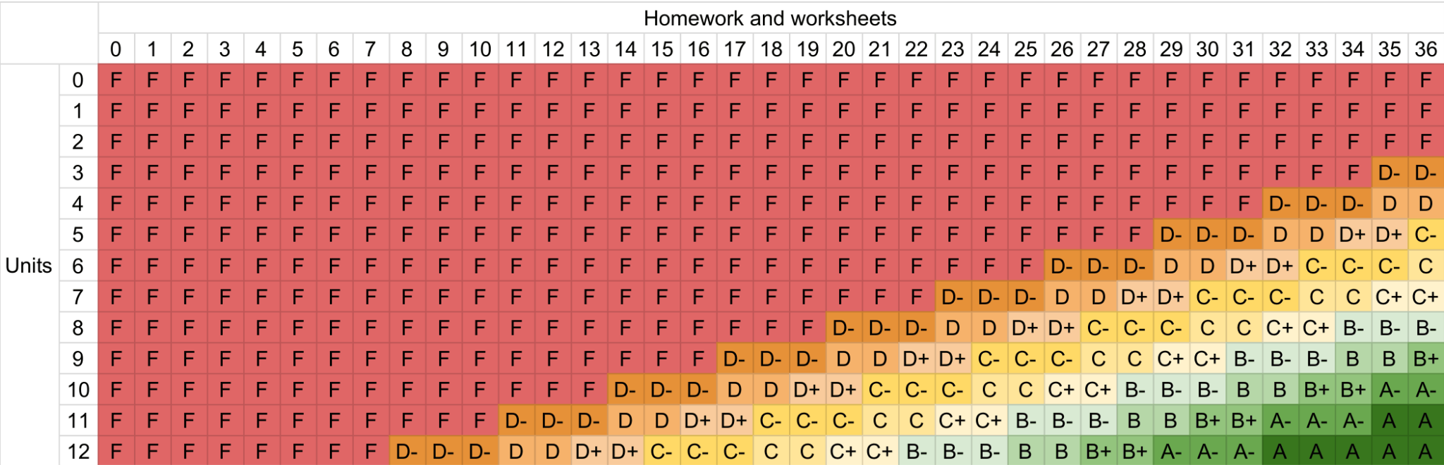
One contrast between the tables (A) and (B) is the ongoing benefit of homework. In the weighted average scale, every point in either category has some chance to bump up a grade, until that category is maxed out. Focusing on row 9 for example (see below), a student with 75% completion in the unit category continues to increase their grade by completing homework until the 36th homework assignment, so they’re incentivized to try to finish homework until the last possible minute, potentially at the expense of focusing on a unit they haven’t completed.
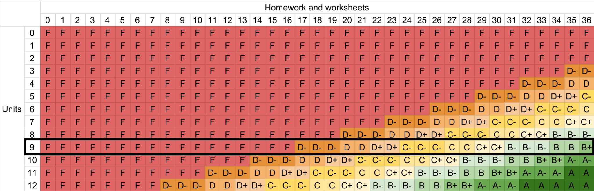
To play devil’s advocate, perhaps this is just a consequence of even weighting of categories. Maybe if we weight the homework at 25% and units at 75%, we’ll avoid this incentive? We can visualize this as well, in the heatmap below. Focusing again on row 9 (black outline), a student with 75% completion in the unit category increases their grade by completing homework until 35/36. Alternately, focusing on the leftmost column (blue outline), it’s possible to pass the class with a C completing no homework whatsoever.
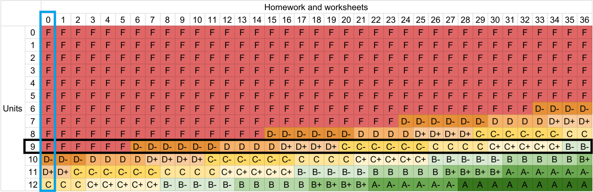
The power of grading heatmaps reveals what we might have seen from the start: the incentive for students to pursue points in the easiest category (whether that be homework or something else) is not a bug of weighted-average grading that can be fixed by choosing the right weighting — it’s a feature. The only way to get rid of that bug is to change the system. So we return to the standards-based grading heatmap:
This heatmap is explicitly designed to avoid both of the potential pitfalls above: students are explicitly required to meaningfully engage with both grade categories, and grades plateau along any given row, removing the incentive to complete every last point of homework. Since there are 36 homework assignments, reaching the point of no additional grades from homework (at 27) is attained by most students 1-2 weeks before the end of the course. So for these students, there is no incentive to scramble for homework points, only an incentive to study for a final exam where they can complete more units.
As a visual thinker, utilizing grading heatmaps to reason through the incentives of a grading structure has been a huge level up for me in setting up my own courses. I can make small tweaks and compare two heatmaps side-by-side, or I can imagine a crazy new experimental grading setup, make a heatmap, and evaluate the resulting incentives.
Making use of grading heatmaps
If you’re currently using tables to communicate grade requirements with students, try also including a heatmap in your syllabus. Or if that doesn’t make sense, just take whatever current grading scale or system you’re using, and try to realize it, or some component of it, as a heatmap. Using it as a visual aid, think about questions like, “What does this system incentivize?” For example, does it incentivize students to work for every last homework point up until grades are submitted, even after the final exam/project? If a student has attained the requirements for a given grade, does that actually imply they’ve demonstrated competency at the level I expect of a student receiving that grade?
I hope that this tool can help you as much as it has helped me!

Cool idea. Any thoughts about how to extend this to three or four dimensions?
Thanks, Joshua! I love the clarity that your heatmaps provide. I'm going to experiment with this for my fall courses.
Here's a question. When I look at any of your examples, I am struck by how many more times F occurs than A does. The first example has 15 F boxes and 2 A boxes, if I counted right. This isn't a reflection on your grading approach, which is entirely reasonable; rather, it's just a visual artifact of the heatmap. It comes from the fact that when you consider all possible pairings of homework scores and unit scores, more of those pairings result in an F than result in A, which makes sense and is appropriate. But I'm wondering how students perceive this compared to the traditional table, which has equal representation of F and A (one row each). I could imagine a student looking at the heatmap and thinking "wow, so many ways to fail." Do you have any experiences with student perceptions on this point?